Figma plugin for Storybook


One of the biggest challenges in frontend dev is keeping designers in sync with what’s in production. UI design and implementation live in separate places (design tools and code), which naturally diverge over time. This can lead to confusion around the source of truth for what UI should look like.
To address that challenge, today I’m stoked to launch Storybook Connect for Figma, a plugin that lets you link Storybook stories to Figma designs. This connectivity helps you compare implementation vs design specs to speed up handoff and UI review.
🔗 Link stories to component variants
🕹 Play with live implementation in Figma
📌 Highlight components to reuse
📐 Compare story to spec
🔐 Set up private projects with access control

Why we’re partnering with Figma
We believe integrations help teams ship UIs with less work. Storybook is an industry standard because it's built to be interoperable.
In the past, we've focused heavily on technical integrations like Testing Library, TypeScript, Webpack, and Vite. Earlier this year, we began researching design integrations. Components are core to both Storybook and many design tools, and our goal was to bring designers closer to the development workflow to improve communication between the two worlds.
Meanwhile, Figma was exploring how to bridge that same gap from a design point of view. So who better to partner with? We worked with Figma to map out the plugin functionality and build the initial proof of concept.
Visual testing in Storybook: Storybook 8 (2024) gives developers more power than ever to catch unexpected changes in UI implementation through the Visual Tests addon, which lets you automatically perform tests on your stories to catch unexpected rendering bugs or changes. Learn more about visual testing in Storybook.
Connect Storybook and Figma
Storybook Connect for Figma links stories to their corresponding variants. This helps teams resolve inconsistencies earlier in the design process and identify reusable components.

Link stories to component variants
Link assets once and they’ll automatically stay up to date with the latest versions of the design or implementation. What’s more, that extends to all component instances and across your team, so folks don’t have to link components over and over again.
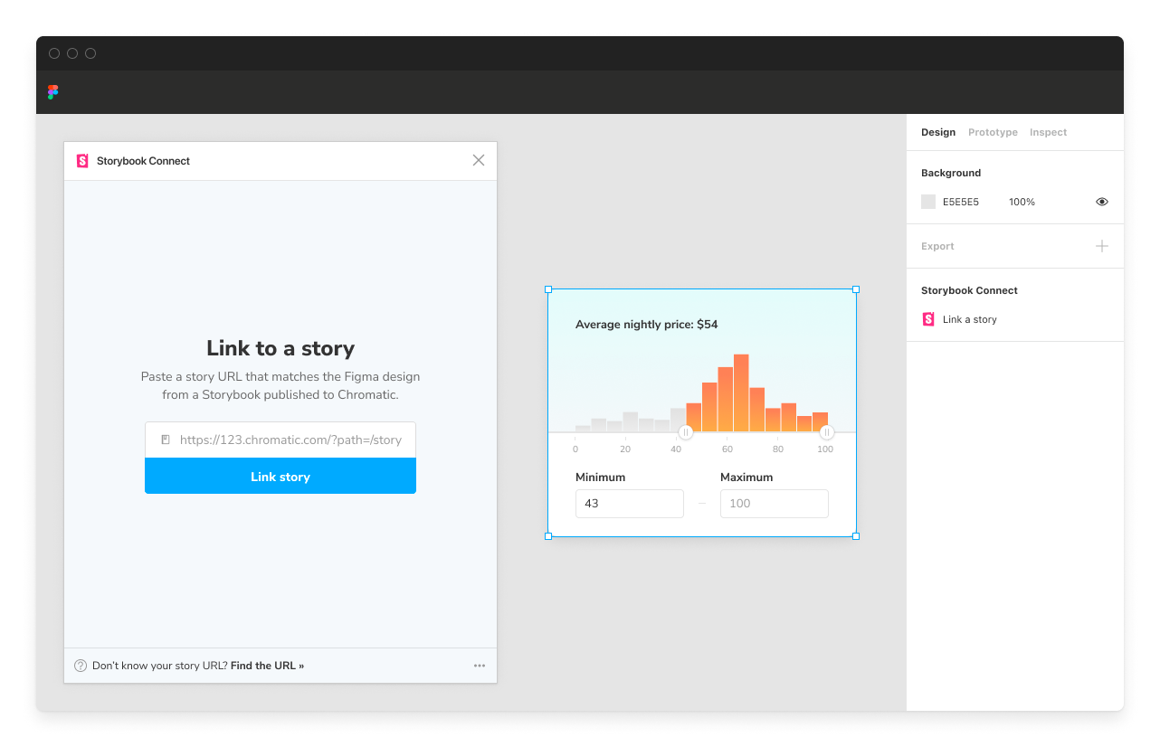
Click on the component in Figma then paste the story URL that matches the design.
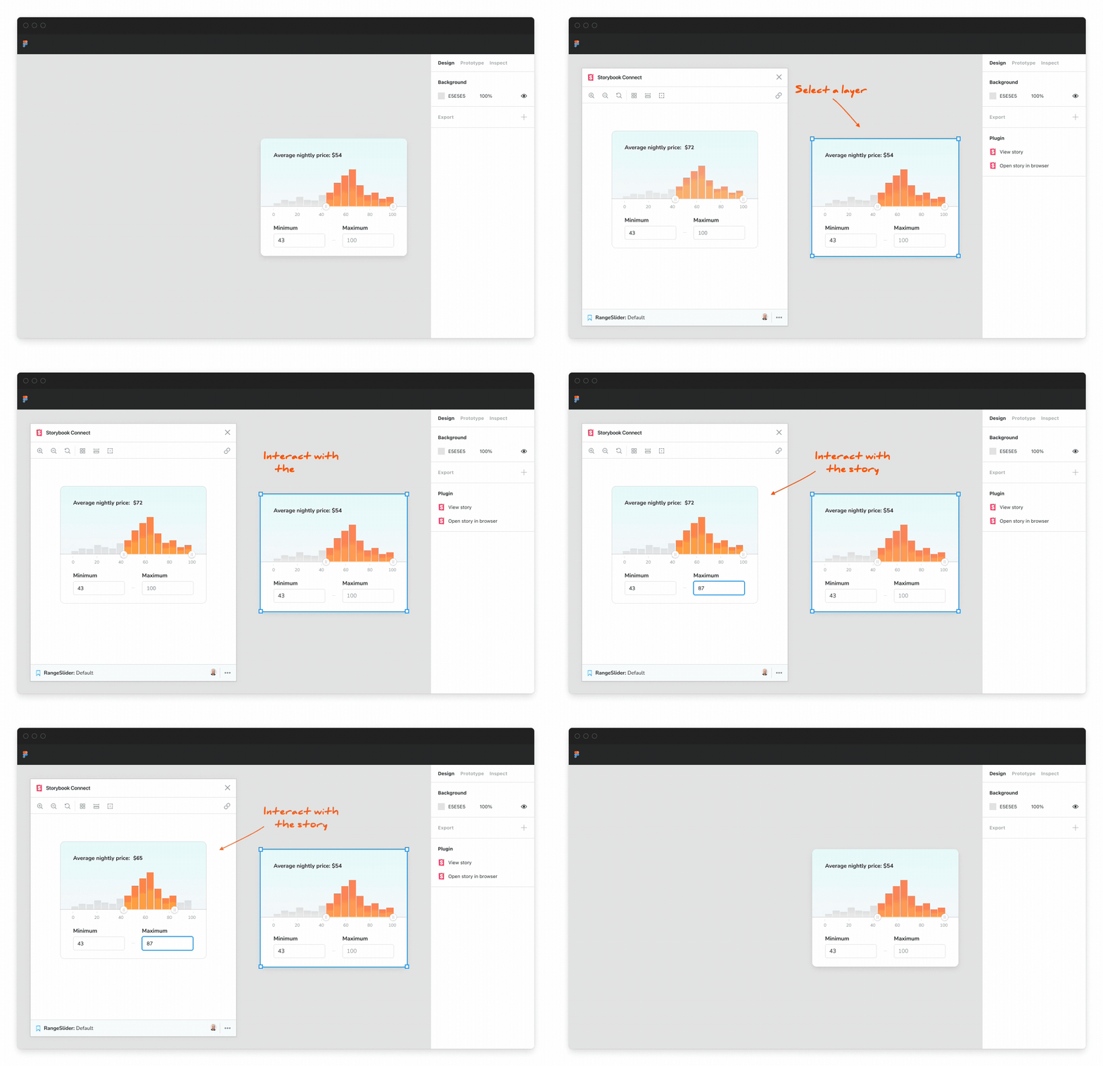
Open the plugin to reference the live story. Designers can check how a component works before using it in their designs.

Hand off designs to developers
Design handoff is the process of passing specs to developers for implementation. Unfortunately, this can be a lossy process, and design details regularly get lost in translation, especially when there’s a tight deadline (and there is so often a tight deadline).
Storybook's Figma plugin streamlines handoff by calling out which design components have already been implemented in the Figma sidebar.
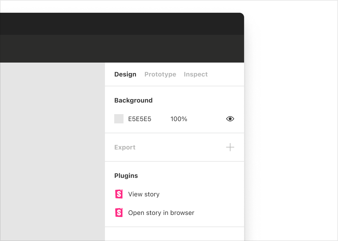
Components with links to stories are called out in the Figma sidebar.
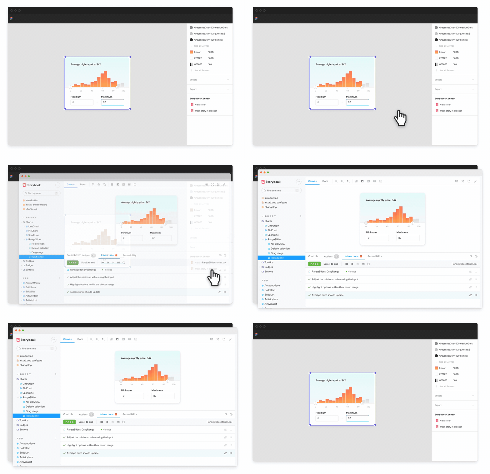
During handoff, click “Open story in browser” to jump into the complete Storybook environment with addons, tests, and API docs.

Review UI implementation with designers
UI review is a process of gathering feedback on UI implementation from designers. It’s used to flush out non-obvious design details and technical hurdles and confirm that the implementation meets the design spec.
Storybook's Figma plugin helps designers check that the rendered UI matches the design via Storybook addons. Use the Measure addon to compare dimensions and spacing of DOM elements vs design specs.

Alternatively, use Storybook's Outline addon to visualize the boundaries of each DOM element for debugging CSS alignment.

You can also verify whether a component’s color palette is accessible by toggling the visual filters within Storybook's Accessibility addon to simulate different forms of colorblindness.
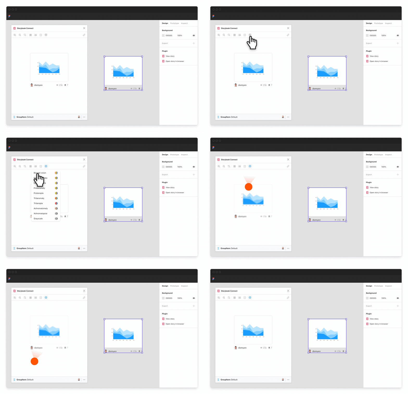

Try the plugin now
Storybook Connect for Figma is powered by Storybook embeds and Chromatic, a visual testing and publishing tool created by the core Storybook team. Follow the instructions below to get started!
Prerequisites
- Your Storybook project is published on Chromatic
- Figma editor role
- Listed as a collaborator in Chromatic
Link the Storybook URL to Figma components
Install the Storybook Connect plugin from the Figma community
Open the plugin. Use the command palette in Figma CMD + / then type Storybook Connect.
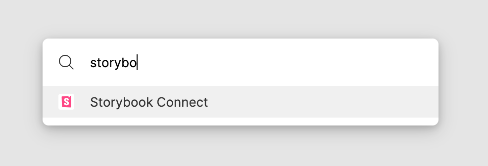
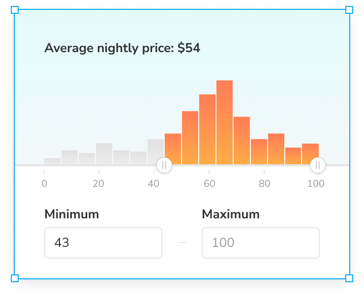
3. Select a Figma component to link. The plugin supports linking stories to Figma components, variants, and instances. The addon does not support linking stories to layers.
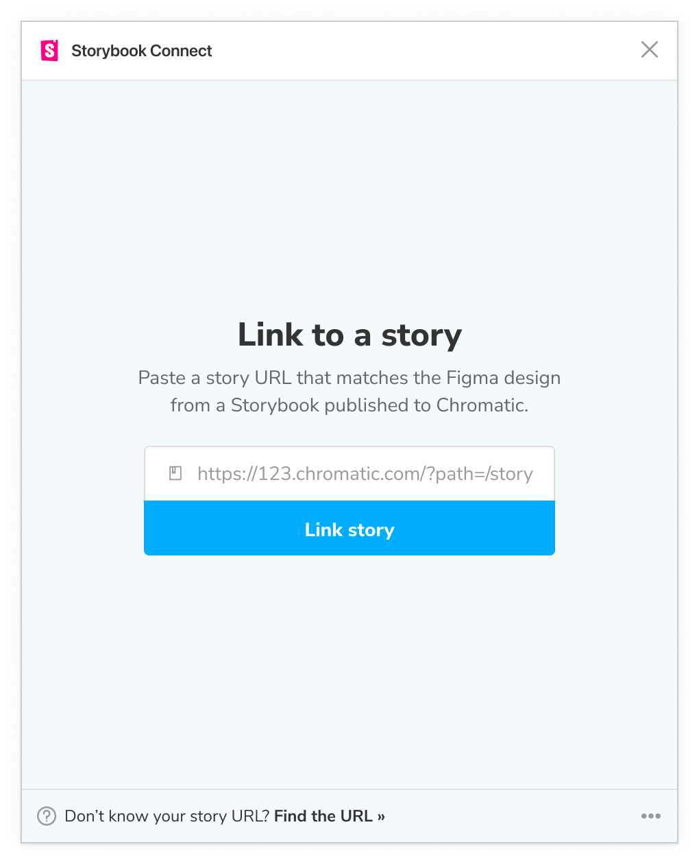
4. Paste the URL to the story into the plugin’s form field to link the story to your Figma component, variant, or instance.
5. Once linked, the component and its instances will all have links in the sidebar to view the corresponding story.
Open a story in Figma
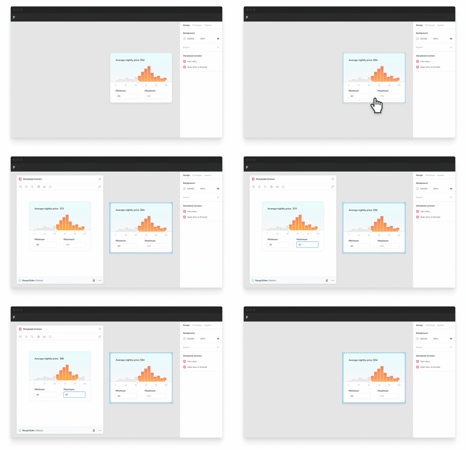
Select the component that you’ve previously linked in Figma.
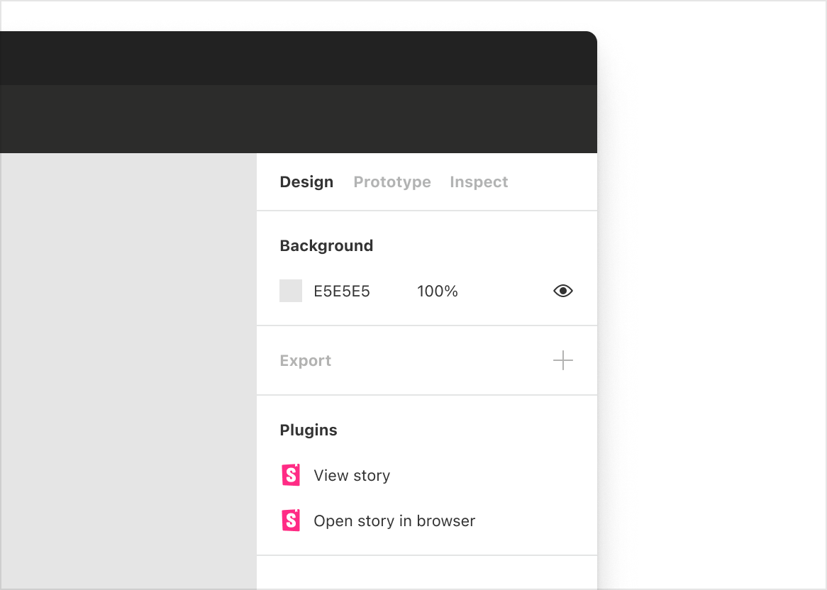
Then navigate to Figma’s Design sidebar tab and click the “View story” action. Alternatively, open the plugin by using the command palette command + / then type the name Storybook Connect.
Learn more
- Install the plugin from Figma community
- Full setup guide in Figma community
- Overview of design integrations for Storybook
Figma plugin is live! GA
Compare stories vs design specs to speed up handoff & review.
🔗 Link stories to components/variants
🕹 Play w live implementation in Figma
📌 Highlight components to reuse
🔐 Setup private projects
Try it » https://t.co/eN62PltceQ
🧵1/ pic.twitter.com/Jyxry10Qsm
— Storybook (@storybookjs) April 27, 2022
🙏 Shoutouts: The plugin was developed by Jono Kolnik, Michael Arestad, Gert Hengeveld, Zoltan Olah, and Dominic Nguyen (me!). Much appreciation to early access users kaelig, yngvenilson, michalzadkowski, oogo, pilotconway, rikot, w-a-t-s-o-n, reony, webhode, and hundreds more. Special thanks to Figma’s Emil Sjölander and Emily Brody for supporting our open source community.


