Visual testing in Storybook


Storybook’s Visual Tests Addon (VTA) is a new way to catch UI bugs. With the click of a button in Storybook’s UI, you can use the addon to test all your stories for visual changes against their previous versions. Then, you can filter the Storybook sidebar to show only stories with changes, and review those changes one by one.

This new workflow is a huge step for UI development, surpassing unit tests in every dimension:
- Visual tests need less code yet yield more useful results than unit tests, validating how UI looks and works
- The entire visual testing process is available when you need it the most: inside your component workshop
- The addon is powered by Chromatic, a battle-tested cloud service built by Storybook’s core team that captures fast, flake-free snapshots
If you’re still unit testing your components, read on to learn a better way to develop UI.
Less code, better tests
Visual tests are easier to write than unit tests while also providing more test confidence.
Take the first example of from Cypress CT’s docs:
import Button from './Button'

it('uses custom text for the button label', () => {
  cy.mount(<Button>Click me!</Button>)
  cy.get('button').should('contains.text', 'Click me!')
})
This test mounts the Button component, then asserts the text contents of the button label. Testing tools like Playwright, Jest, and Vitest all use similar syntax and constructs.
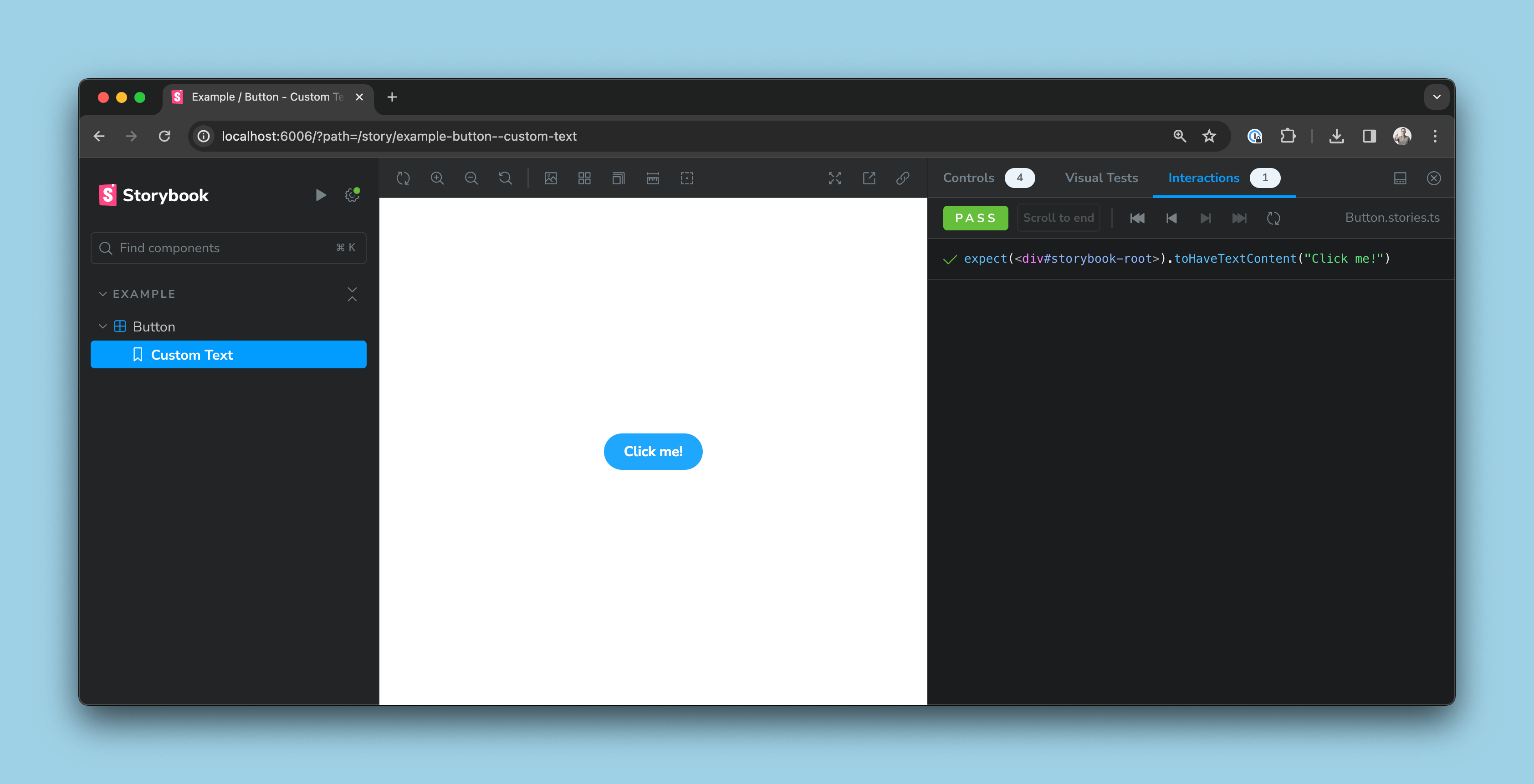
Storybook’s syntax is a little different, but the idea is the same. Here’s a story that’s equivalent to Cypress’s example:
import Button from './Button'
export default { component: Button };

export const CustomText = {
  args: { children: 'Click me!' },
  play: async ({ canvasElement }) => {
	  await expect(canvasElement).toHaveTextContent('Click me!')
  },
};
And here’s what that looks like inside Storybook:
Now, consider the following test for the same Button component:
export const CustomText = {
  args: { children: 'Click me!' },
};
This version appears to be testing less than before. It’s shorter, with no explicit assertion. You might be tempted to call it a worse test!
However, despite its smaller size, it actually tests more. By comparing a visual snapshot of the button to a previously accepted snapshot of the button, it implicitly validates that the button contains the label “Click me!”, but also that the button is blue, has rounded corners, renders with the same font, and so forth.

In this example, I’ve introduced a bug in the global CSS that strips the Button's styling. This would pass Cypress’s functional test, but VTA catches the difference and displays it in Storybook with the
Saving one line of assertion might not seem like a big deal, but the benefits quickly add up. Consider a complex component with a number of assertions:

Now multiply this out across your entire application, which might contain hundreds of components of various complexities. As you scale up, visual tests are significantly easier to write, read, and maintain!
Visual tests at your fingertips
VTA’s innovation is that it integrates visual testing directly into your development process. To see this in action, let’s continue with our simple Button example from above. Below, I’ve introduced a bug in my global CSS that strips the button’s styling.
This test would still pass Cypress CT’s functional tests. But with Storybook’s Visual tests addon, the regression shows up as I’m developing, so I can catch the problem and fix the issue, even if I’m working on a completely different part of my codebase.
For an example of how the Visual Tests addon comes in clutch, here’s our same favorite Button component now containing a bug (it doesn’t display a label):

Even though this button is now broken, it would still pass a basic Cypress component test and the functional test via play function in the story we shared previously. A manual visual test (a quick glance at the component) instantly reveals that it’s broken.
Manual visual testing like this feels acceptable when we’re only working with a single component with one story. But as we develop this UI further, what happens when we suddenly have 100 components that each need to support multiple data states and work in different browsers, sizes, and themes? As the scale of an application increases, so does the size of the challenge.
Comment
When we use the Visual Tests addon, the addon automatically scans through all stories to pick up visual changes for us. As you can see below, the addon has found a change in the Custom Text story, denoted by ‘1 change’ in the lower left corner and the orange status dot (🟠) in the sidebar indicating that this story has changed. When I review the visual change by opening the Visual Tests addon panel, I realize I’ve introduced a bug: I can see the previously accepted snapshot containing the expected text.
[ Image ]
World-class test infrastructure
Sitting behind VTA is Chromatic, the cloud-based visual testing service developed by Storybook’s core maintainers.

- 🐇 All tests are parallelized by default
- 🌎 Chrome, Safari, Firefox, and Edge
- 💅 Specify viewport, i18n, and CSS media features
- ➕ **Embed, Figma, Slack, and much more...
Storybook is a powerful visual testing tool because you can test how your components/pages work and look in the same environment that you use to develop them.
However, while Storybook’s visual tests are much more ergonomic to write and maintain than traditional functional tests, they still require you to complete tests and validate the results one at a time. That’s why we built Chromatic, a cloud-based visual testing tool that automatically scans Storybook stories for visual and functional changes on each new
💡How does Chromatic work?
Chromatic identifies visual changes through a process of snapshot comparison: it captures a snapshot of how a component should look (across as many states and variants as you require), then captures a new snapshot after changes and performs a diff comparison between the two.
In Storybook 8, we bridged the gap between our two tools by enabling visual test automation inside Storybook through the Visual Tests addon. Whereas Chromatic usually runs in CI to catch changes before they’re merged to the main branch, the Visual Tests addon lets you run automated visual tests on demand inside development without needing to wait on a CI pipeline to complete a bunch of other checks that are unrelated to building UI.
The Visual Tests addon makes it faster than ever to catch UI bugs and — we hope — brings you a more powerful testing toolbox in Storybook than ever. Next: here’s how the addon works.
Bringing it all together, and beyond
Visual tests are the easiest tests you’ll ever write: by not having to write any test code at all. Yet they still catch a broad range of problems—both functional and visual. We’re continuing down this road of giving you more while requiring less, like this very early prototype design of a new option to save new stories from control configurations.
Try it today
Storybook’s Visual Test Addon is included in new Storybook installations:
npx storybook@latest initAnd if you’re upgrading from an older version of Storybook you’ll now be prompted to choose if you’d like to install the addon to your existing project:
npx storybook@latest upgrade


